
How to Build a Sustainable Packaging Moodboard for Shampoo and Conditioner Bottles
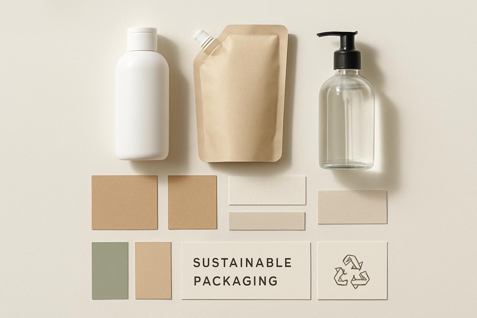 A good moodboard doesn’t just make your packaging look “eco.” It prevents expensive rework.
For shampoo and conditioner bottles, sustainable packaging decisions touch everything at once: resin choice, pump/closure selection, label stock, decoration methods, how the bottle feels in a wet shower, and whether your sustainability claims can survive procurement and compliance review.
This guide shows you how to build a sustainable packaging moodboard that does two jobs:
- Creative alignment: your design team knows what “sustainable haircare” should look and feel like.
- Execution alignment: your packaging engineer and supplier can translate the vibe into materials, finishes, and manufacturable specs.
What a sustainable packaging moodboard needs (and what it’s not)
A packaging moodboard is a curated collection of visual references that defines the direction for a packaging project. For packaging, the useful parts tend to be layout, color, typography, and texture, not just pretty images (Bizongo’s overview of packaging moodboard elements (layout, color, type, texture)).
What a sustainable packaging moodboard is not:
- a Pinterest dump
- a set of vague claims (“clean,” “green,” “natural”) with no proof points
- a single hero bottle photo that ignores the full system (closure, label, secondary pack, shipper)
Done when…
You can hand the board to someone who wasn’t in the kickoff meeting and they can answer:
- What material family are we leaning toward (and why)?
- What sustainability cues are we using (and avoiding)?
- What finishes and decoration methods fit the story?
- What must stay true when we go to suppliers (color, translucency, tactile feel, recyclability path)?
Step 1: Define the constraints for shampoo and conditioner bottles
Before you collect imagery, write down constraints. If you skip this, you’ll build a board that can’t survive real-world requirements.
If your team is also searching for reference patterns for sustainable shampoo bottle packaging, this step is what keeps inspiration grounded in performance, claims, and manufacturability.
1) Product + formula realities (keep it simple, but real)
You don’t need to publish your formula details, but you do need a practical packaging profile.
Capture:
- Viscosity range: watery shampoo vs thick conditioner changes closure needs.
- Use environment: wet hands, shower shelf, slippery surfaces.
- Dispensing expectation: flip-top? pump? disc-top? trigger? (Each creates different recyclability and aesthetic constraints.)
- Barrier needs: scent retention and oxygen sensitivity matter for some formulas.
Be cautious with compatibility claims. For many formulas, you won’t know what works until you run stability and compatibility testing.
2) Channel and distribution
A premium bathroom bottle that looks great on a shelf can still fail in e-commerce.
Decide:
- Primary channel: DTC, retail, salon, travel.
- Shipping risk: drop tests, leaks, scuffing, label abrasion.
- Secondary/tertiary pack needs: do you need a carton, or can you ship in a branded shipper?
3) Brand position and price point
“Sustainable” looks different at different price points.
Define three adjectives that describe your desired packaging impression (examples: “refined,” “minimal,” “science-forward,” “spa-like,” “playful”).
Done when…
You have a one-page constraint list your design and sourcing teams agree is real.
Step 2: Pick your sustainability “non-negotiables” (so the board doesn’t greenwash)
Sustainable packaging can’t be decided on aesthetics alone. Start with a short set of rules that your moodboard must follow.
A helpful framing is that packaging design choices should reduce environmental impact across the lifecycle (the Sustainable Packaging Coalition’s guidance on packaging design is a good high-level reference).
These non-negotiables also help you avoid a board that looks eco but fails basic recyclable packaging design principles once you get into components, adhesives, and labels.
Pick 2–3 of these as non-negotiables:
- Mono-material where possible: fewer mixed materials makes end-of-life simpler.
- Recyclability path is clear: the consumer should know what to do.
- Recycled content (PCR) where it makes sense: reduce virgin plastic.
- Refill strategy: either a refill pouch, cartridge, or an in-store refill program.
- Lightweighting/right-sizing: reduce material use without compromising function.
Pro Tip: Write your non-negotiables as testable statements, not slogans.
Bad: “eco-friendly bottle.”
Better: “Bottle body is PET with PCR content; label/decoration won’t prevent recycling; we avoid multi-layer sleeves when possible.”
PCR PET note (because haircare bottles often want the “recycled” story)
PCR means post-consumer recycled content. When you’re moodboarding for a PCR PET bottle, plan for the practical constraints: resin can vary batch-to-batch, aesthetics can shift (color/clarity), and documentation matters. For a technical view of variability, see PCR resin variability and characterization considerations from TA Instruments.
If you plan to mention recycled content on-pack, treat verification as part of the design system, not an afterthought.
Done when…
Your moodboard has a “rules” panel that prevents the team from choosing visuals that can’t be executed responsibly.
Step 3: Collect materials and finishes that match the sustainability story
This is where most moodboards stay too abstract. Don’t just collect bottle photos. Collect material cues.
1) Primary container directions to explore
For shampoo and conditioner, you’ll usually be choosing between:
- PCR PET / rPET-style clarity (with realistic expectations for tint/clarity at higher PCR percentages)
- HDPE/PE family look (often more opaque, durable, utilitarian)
- Glass (premium and inert, but heavier and higher breakage risk)
If you need language to explain trade-offs internally, Yuxi Packaging’s overview of plastic vs. glass packaging trade-offs is a simple starting point.
2) Closure and dispenser direction
Closures are often the hidden sustainability bottleneck.
Collect references for:
- flip-top caps (simple, common)
- disc-top caps (common for shampoo)
- pumps (better for thick conditioner, but more complex)
- refill pouches and spouts
On your board, label closures with a note: “simple” vs “complex” and “easy to disassemble” vs “hard to disassemble.” Even if you don’t decide today, you’re making the trade-off visible.
3) Label and decoration direction
If you want the packaging to be sustainable, your decoration choices matter.
Collect:
- uncoated paper label textures
- clear vs opaque labels
- low-ink, minimal coverage examples
- direct print vs label examples
For design cues that communicate sustainability without shouting, Yuxi Packaging’s sustainable skincare packaging design cues includes a list of materials and finish ideas you can translate into moodboard tiles.
4) A small set of “hard samples” (even if your moodboard is digital)
Aim for 5–8 physical items your team can touch:
- a bottle with a matte surface vs glossy
- a label stock swatch
- a kraft carton sample
- one refill pouch example
This prevents your direction from drifting into “looks sustainable on screen” but feels cheap in hand.
Done when…
Your board contains real material/finish references, not just product photos.
Step 4: Build the visual system (color, type, texture, icons) without fake sustainability cues
A sustainable moodboard is a system. It needs constraints.
1) Color palette: pick cues that match your claim strategy
Common sustainable packaging palettes use neutral and earthy tones, but don’t default to “sage + kraft” if your brand is clinically positioned.
Create:
- Core palette (3 colors): primary, secondary, neutral
- Accent palette (1–2 colors): for shelf pop or variant coding
If you’re using PCR plastics, remember you may get natural tinting. Your palette should tolerate that.
2) Typography: legibility is part of sustainability
Haircare packaging is used in wet environments. Tiny type is not premium; it’s frustrating.
On the moodboard, include:
- one primary sans-serif font style reference
- one secondary font style reference (optional)
- examples of high-contrast text on bottle + label
3) Texture and finish: decide what “premium sustainable” means for you
Create a mini matrix on the moodboard:
| Element | Option A | Option B |
|---|---|---|
| Bottle finish | matte / soft-touch | glossy |
| Label feel | uncoated / tactile | smooth film |
| Visual density | minimal ink | illustration/pattern |
The point isn’t to lock every decision. The point is to make trade-offs visible.
4) Icons and claims: design for proof, not vibes
Add an “icons and claims” strip with placeholders like:
- “Made with X% PCR” (only if you can verify)
- recycling instructions
- simple disassembly guidance
For recycled plastics, documentation and source controls are the reason these claims are taken seriously. The FDA’s overview on recycled plastics and contamination controls explains why regulators focus on inputs and process controls.
⚠️ Warning: Avoid vague front-of-pack claims like “eco,” “planet friendly,” or “green” without specifics.
Your moodboard should include the exact phrasing style you’ll use (specific, measurable, and defensible).
Done when…
Your board shows what the packaging looks like and how sustainability will be communicated responsibly.
Step 5: Translate the moodboard into a supplier-ready brief (this is where teams win)
A moodboard only becomes useful when it turns into a brief suppliers can quote and prototype against.
Add a final column or panel titled: “Supplier handoff: required decisions.”
Include:
1) The packaging system list
- Bottle (shampoo)
- Bottle (conditioner)
- Closure/dispenser for each
- Label or print method
- Secondary packaging (if any)
2) Material direction (by component)
Write it as “direction,” not a final spec:
- Bottle body: PET with PCR content (target range) or HDPE direction
- Closure: simple cap vs pump direction
- Label: uncoated paper vs film direction
If you want a concrete example to show procurement how suppliers talk about PCR options, you can reference Yuxi Packaging and their PCR bottle options (MOQ and customization), including the fact that customized color/printing may have MOQ considerations.
3) Key questions to ask suppliers (copy/paste)
- What PCR options are available for this bottle, and what documentation supports the PCR content?
- What color/clarity variation should we expect at the target PCR percentage?
- What decoration methods do you recommend that won’t complicate recyclability?
- What are typical MOQs, lead times, and sampling steps for this design?
- What tests do you recommend for leak resistance and e-commerce shipping durability?
Done when…
A supplier can look at the board and your handoff panel and propose a sampling plan, not just “nice design.”
Common mistakes that derail sustainable haircare packaging moodboards
- Using sustainability aesthetics as a substitute for sustainability strategy.
- Ignoring closures. The bottle might be recyclable; the pump might not be.
- Overpromising recycled content in a palette that can’t tolerate tinting or variation.
- Picking finishes that fight recyclability or reuse goals.
- Skipping documentation planning. Claims become a scramble at the end.
- Not stress-testing the design for wet use and shipping. A moodboard that ignores leakage and scuffing is incomplete.
FAQ
Is a sustainable packaging moodboard only for designers?
No. The best ones are built with design, packaging engineering, procurement, and sustainability/compliance in the same room (or at least reviewing the same board).
Can PCR bottles look premium?
They can, but plan for variability. High-PCR content can reduce clarity and shift color. Build a palette and finish direction that still looks intentional if the resin comes out slightly warmer or hazier than virgin material.
What’s the fastest way to avoid greenwashing?
Make your moodboard include a “claims style” strip: specific, measurable, and tied to documentation. If you can’t verify it, don’t design around it.
Next steps
If you want to turn your moodboard into something a supplier can quote quickly, convert it into a one-page brief with (1) your component list, (2) material direction by component, and (3) the questions above. Then request samples that match the direction before you commit to final artwork or tooling.
For more background on why many brands switch, you can also reference Yuxi Packaging’s overview of eco-friendly packaging: why brands switch.